TROWMART
A peer to peer neighborhood marketplace.
Industry
Ecommerce/Logistics
Client
TrowMart Inc.
Service
Product Design
Year
2023

Overview
TrowMart is a peer-to-peer neighborhood marketplace mobile application designed to empower local communities by enabling residents to buy, sell, and exchange products, services, and event information within their neighborhoods. The platform offers an integrated delivery system and wallet feature, ensuring that users enjoy a seamless, fast, and cost-effective transaction experience.
The Problem
In many neighborhoods, residents struggle with the inconvenience of accessing nearby products, services, and event information. Traditional marketplaces either focus on global commerce or lack real-time, community-specific offerings. Additionally, local transactions often involve logistical challenges such as slow delivery, poor communication, and lack of trust or payment options.
Project Goals
The TrowMart platform was created to address these challenges by:
Creating a community-first marketplace where users can easily discover and list products, services, and local events.
Providing fast and affordable delivery solutions through a request-and-fulfill system.
Empowering vendors with tools to manage inventory, track orders, and analyze sales.
Integrating a secure digital wallet to streamline payments and transactions for both users and vendors.
Offering a clean, intuitive mobile app experience that enhances local trust and engagement.
Research & Insights
To understand the needs of both neighborhood users and local vendors, I conducted a series of interviews, surveys, and competitor analyses. The research focused on:
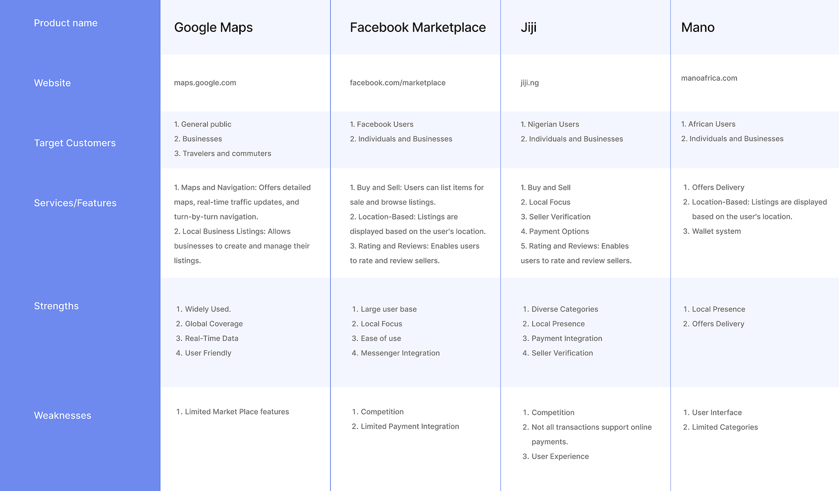
Key Findings:
Residents wanted an easy way to discover nearby services and request fast, affordable deliveries.
Vendors struggled with managing orders, inventory, and reaching local customers.
Most users preferred using mobile apps over websites due to convenience.
Security and trust were recurring concerns, especially for handling transactions and deliveries.
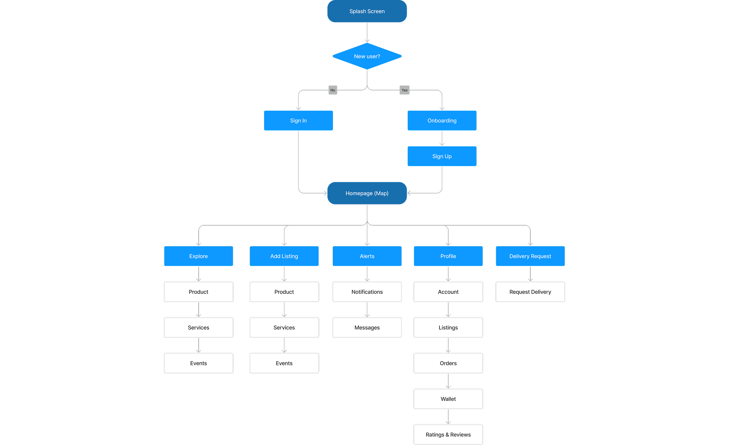
Userflow
Understanding our users' journey within the app was crucial, so I mapped out detailed user flows. By breaking down each step and interaction, I gained insights into how users navigate and where they might encounter challenges.
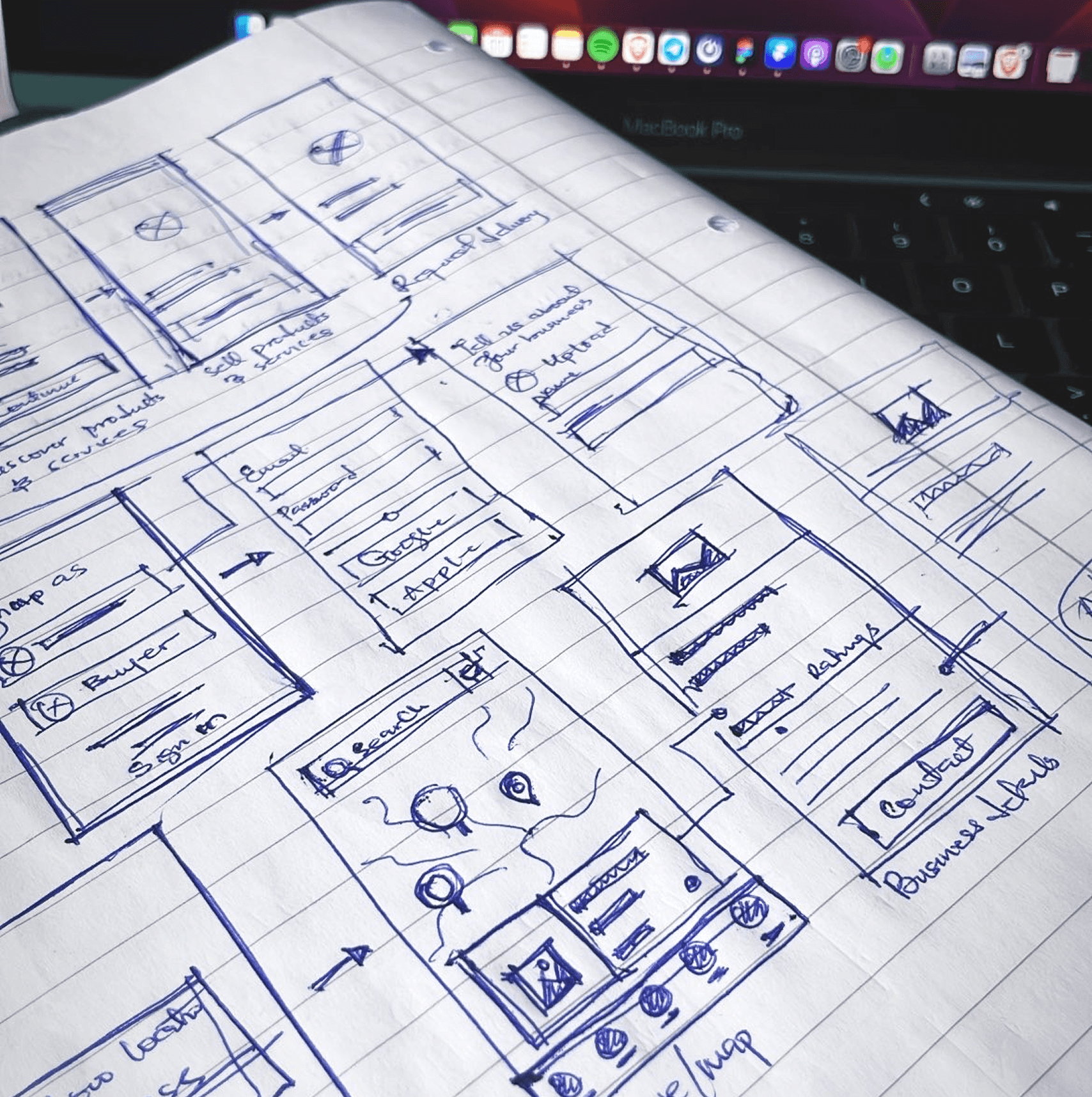
Sketches & Wireframes
After mapping out user flows, I sketched various interface ideas to kickstart the design process. These sketches allowed me to explore different solutions and quickly iterate based on stakeholder feedback.
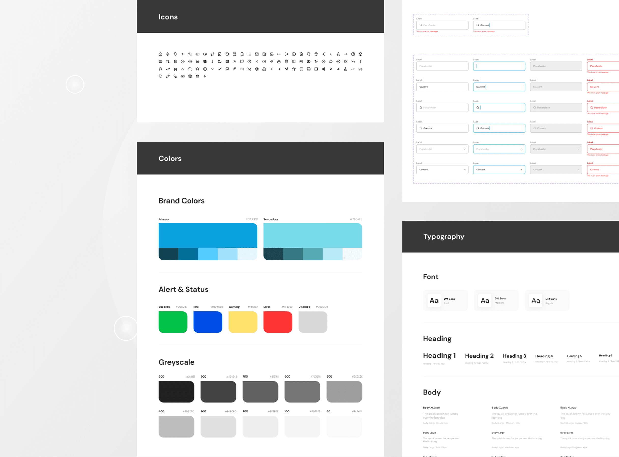
Design System
Once aligned with stakeholders, I created a style guide to maintain consistency on the app. It included specifications for typography, colors, icons, spacing, and interactive elements, ensuring a cohesive user experience across all screens.
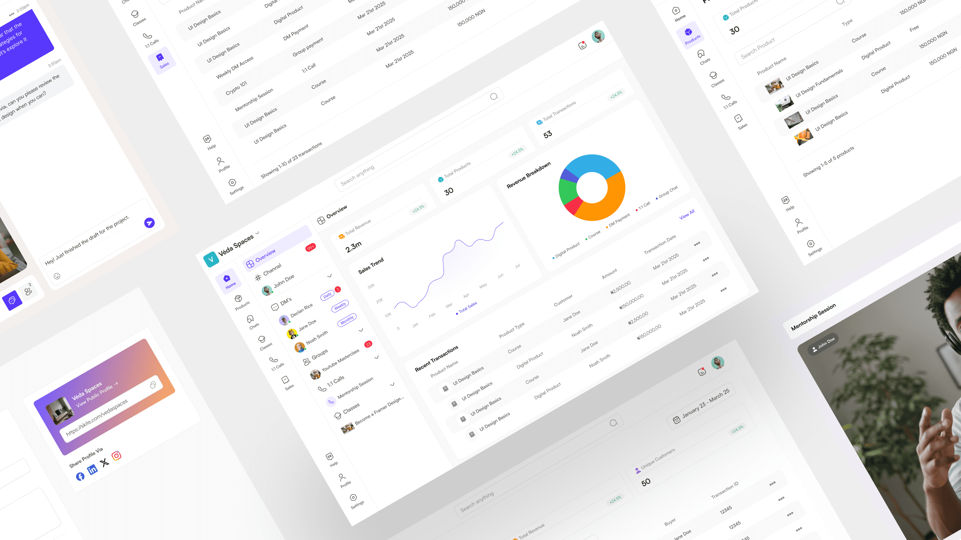
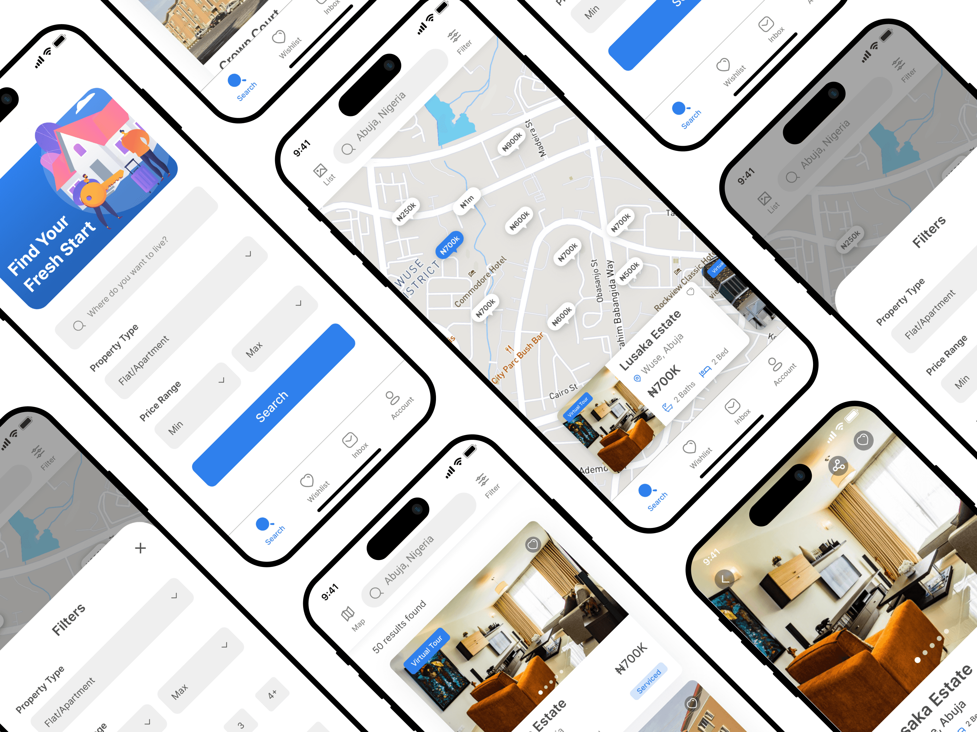
Final Designs
After multiple iterations, here’s a glimpse of the final UI screens:
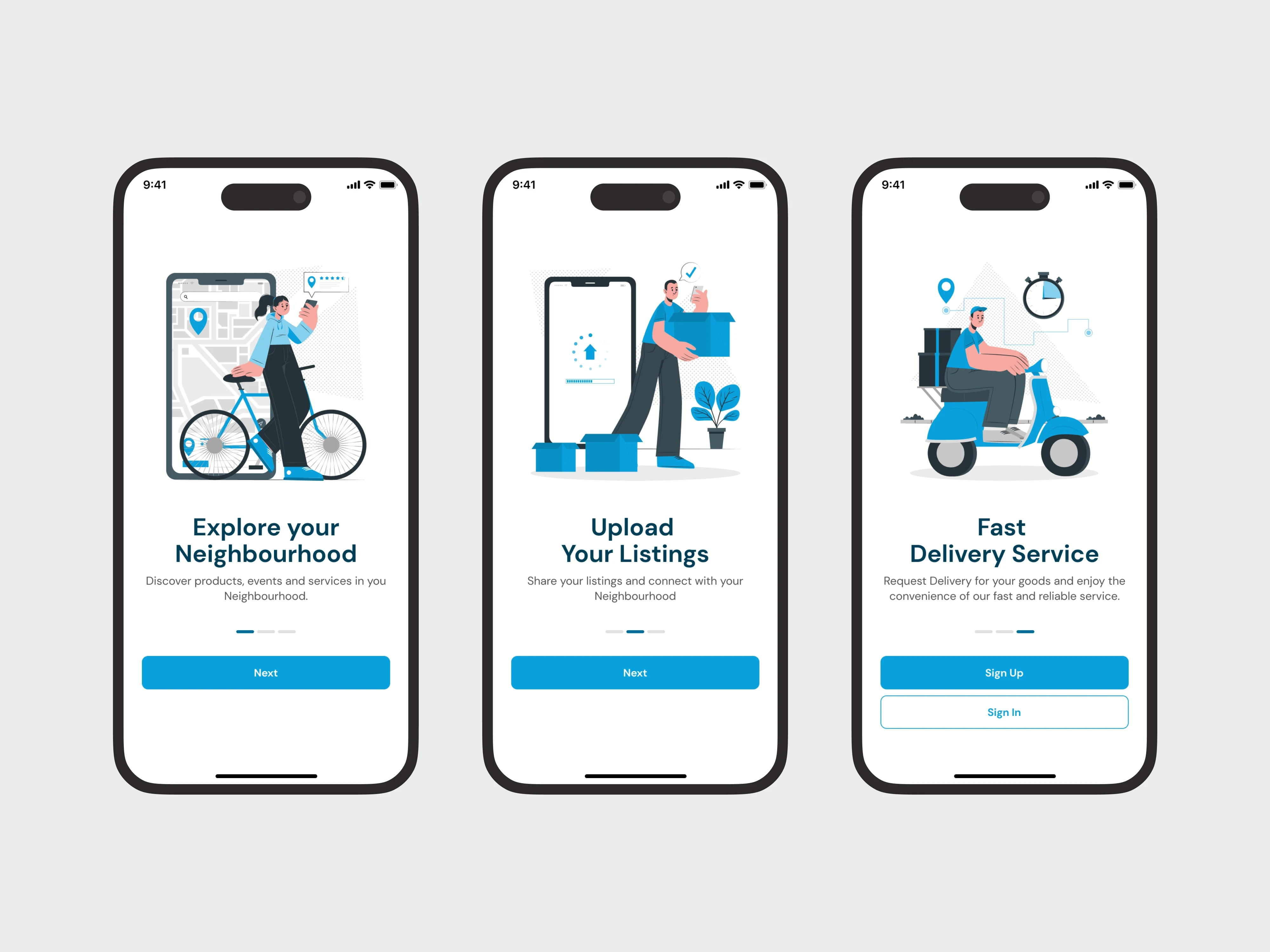
Onboarding
A seamless onboarding flow to quickly familiarize users with the app’s value before they sign up. Each screen highlights a key feature in a concise, engaging way
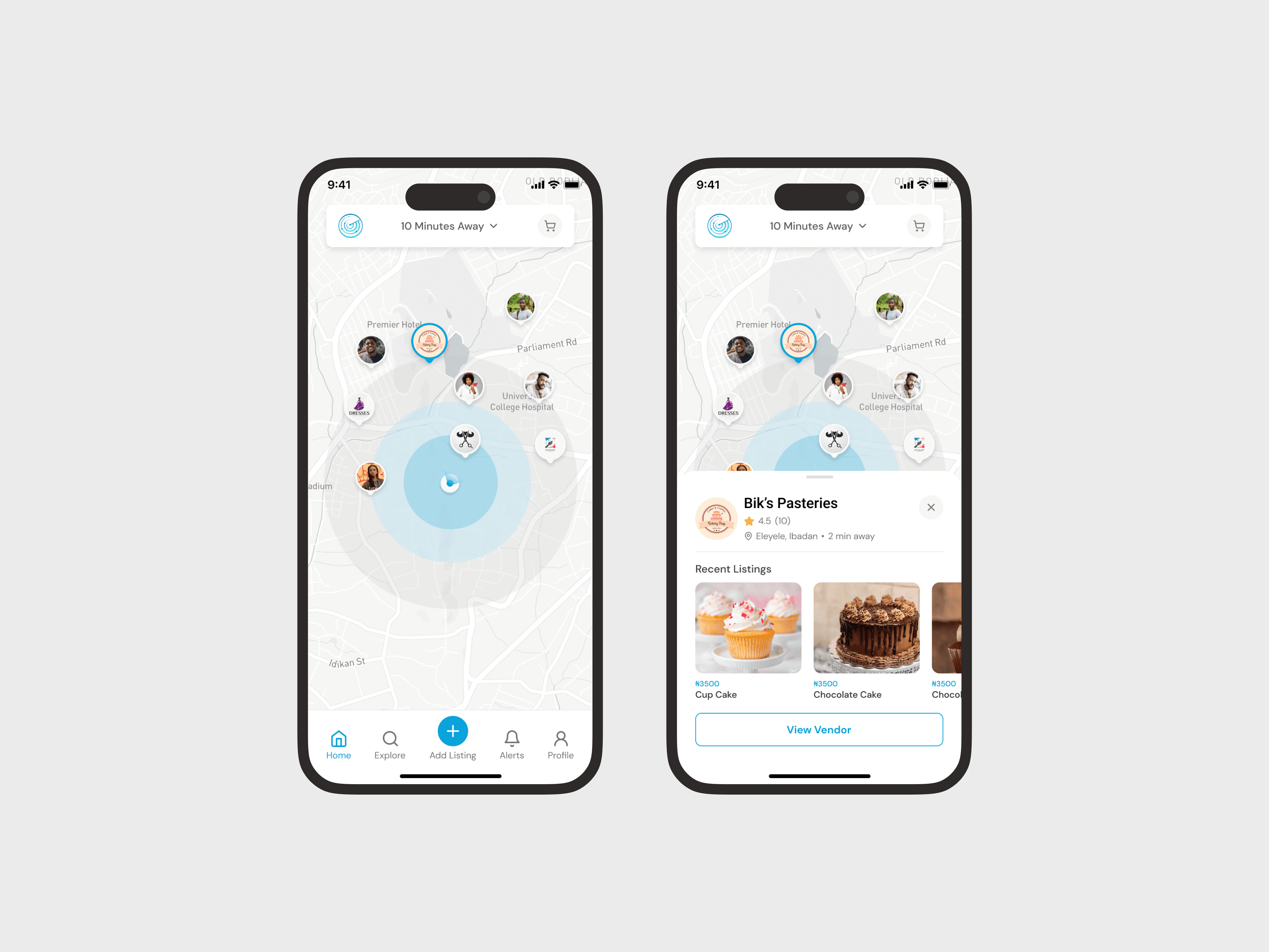
Home Page (Map)
An interactive map view that helps users discover nearby vendors, services, and listings. Tapping on a vendor reveals quick details and recent products, making local discovery fast and intuitive.
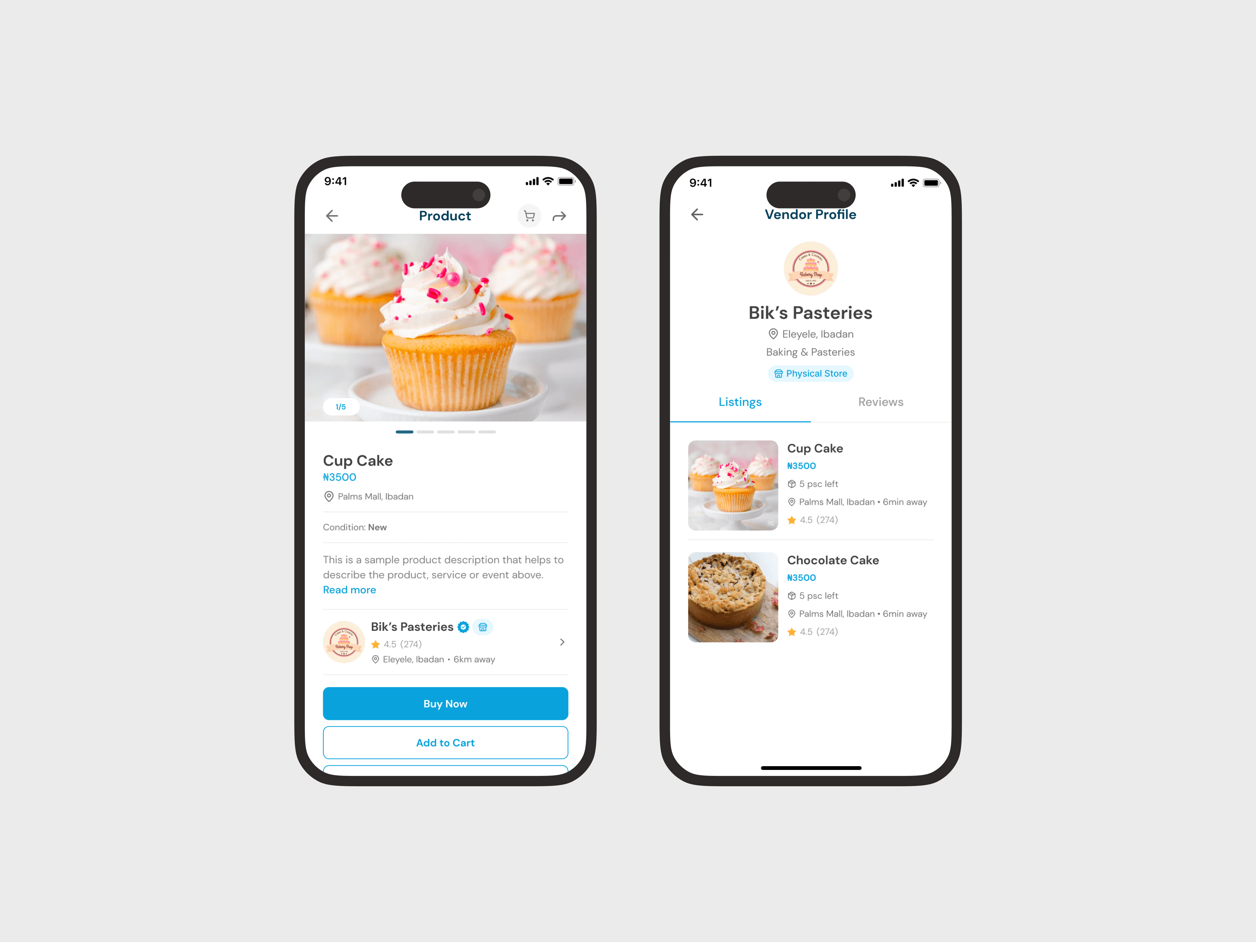
Product & Store Details
Views that showcases key product information alongside vendor details. Users can easily browse product images, pricing, ratings, and access vendor profiles, helping them make quick, informed decisions.
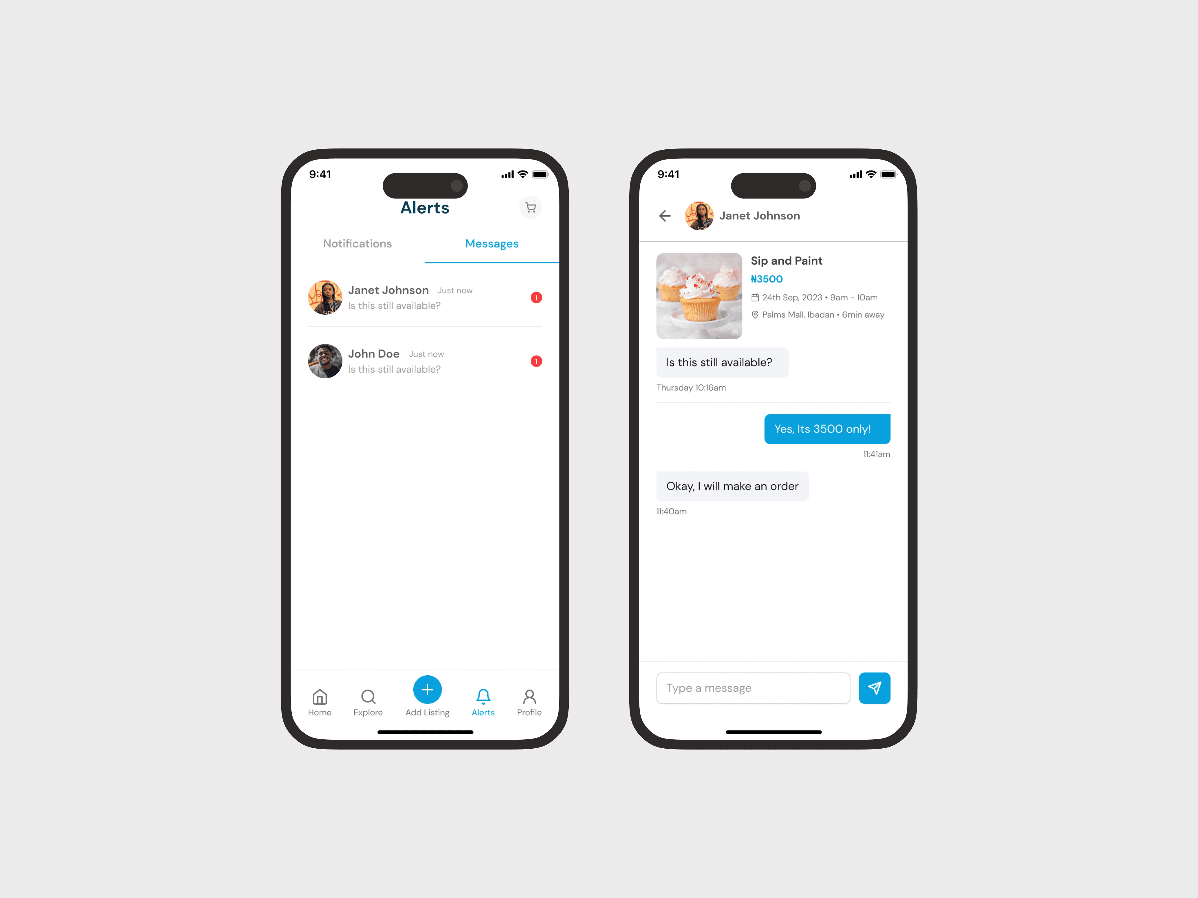
Messages and Notifications
A streamlined messaging system that allows users to connect directly with vendors or other users. Paired with smart notifications, it ensures timely updates on messages, orders, and listing activities
Landing Page
A compelling entry point designed to communicate the app’s value at a glance. With bold visuals and clear messaging, the page encourages visitors to download the app and start exploring local listings, services, and vendors right away.

Lessons Learned
This project taught me the importance of designing for context. Understanding the hyperlocal environment changed how I approached accessibility, simplicity, and trust. Some key takeaways:
Always prioritize user trust when handling money and deliveries.
Vendors need just enough complexity—too many features overwhelm.
A flexible but clear design system saves massive time later.